Designing for scalability
During my time at Sandvik, I helped to lay down the foundations of an ambitious product iteration by consolidating an assortment of inconsistent and redundant UI elements.
Domain
Manufacturing
Year
2020
Back in the day, we worked on improving the accessibility of the programming solution for the CNC machines. The intention was to bring the programming experience to the devices and platforms Sandvik customers use every day.
We kicked off the project like we always do — with discovery work. Following that, we sailed through the exploration and conceptual work. Then we got into visual interface design and everything went pear-shaped.
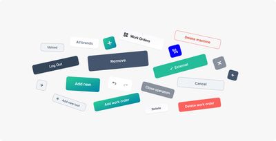
The product was developed with focus for rapid growth, and visual language has struggled to scale alongside. This had a major effect on UI components: making them inconsistent, redundant, and almost impossible to scale. We had to rethink visual language and UI elements to build something that could scale across multiple devices.
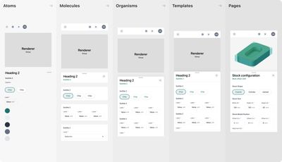
Working with the engineering team, we integrated foundations with components. To pull this off, we introduced a hierarchical structure based on nested components. Building components in this manner kept things connected, which made it easy for design and engineering to modify, extend and improve components over time.
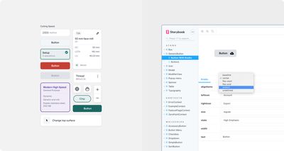
As part of the efforts to move away from fragmented, stand-alone libraries, we built a library in Storybook, which served as a centralised hub of all the UI components. In effect, this allowed us to mix, match, and reuse components throughout the project promoting consistency and cohesion across multiple platforms.
The unified component library was the cornerstone of our efforts to improve the product and how we were working: from building a more consistent experience across devices to forming a closer partnership between design and engineering.