Redefining programming
As part of the team at Sandvik, I helped to bring CNC machine programming experience to the multiple devices and platforms Sandvik customers use every day.
Domain
Manufacturing
Year
2021
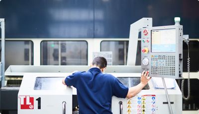
Sandvik is a global engineering company at the start of its digital transformation. Driven by the mission to improve industrial machining workflows — the company developed a touch-based, CNC machine programming solution.
Following a soft-launch, the solution received a positive response from the industry’s early adopters. However, further market research revealed a large group of experts who didn’t have access to touch-based devices — they were first, and foremost desktop users.
This presented an opportunity for Sandvik to improve the adoption rate by making the solution available on multiple devices and platforms, including the humble desktop. Our challenge was to make that happen.
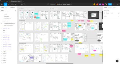
We began the project with discovery work. First, we talked to machining experts — this helped to build empathy for the users: their goals, needs and ways of working. Then we defined the problem and requirements — in effect, this helped us to frame what we’ve learned and synthesize it for the rest of the team.
Next up, we started collaboration sessions. This involved sketching together, mapping user flows, sharing and building on the ideas of others. This had a major effect on the diversity of ideas and helped us to find great solutions more quickly and effectively.
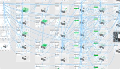
Following ideation, we built functional prototypes to evaluate solutions with users. This gave us a sense of what users expected from desktop-based programming experience, and allowed us to adjust our efforts accordingly.
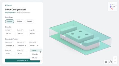
After converging on the interaction model, we shifted our focus to visual interface design. This is where I had an opportunity to rethink how we approached visual language, components and patterns to ensure the solution could conditionally adapt based on the device's screen dimensions.
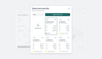
I'm particularly proud of what we've accomplished as a (relatively) small team at Sandvik: from navigating challenges, diverse (sometimes conflicting) perspectives, and technical constraints to delivering a solution that enabled access to one of the most intuitive CNC machine programming experiences.